
MLA recently opened the abstract submission system for the 2020 conference in Portland. Since it’s in my hometown, I really want to attend, especially since I skipped last year’s conference in Chicago. I’ve been brainstorming abstract ideas to help make this happen, since I can make a stronger case for my attendance at work if I’m presenting something. Plus, I just like making and sharing presentations!
So with presentations on the brain, I was particularly interested in a tweet I saw from Cochrane Collaboration, showcasing a new type of poster design.
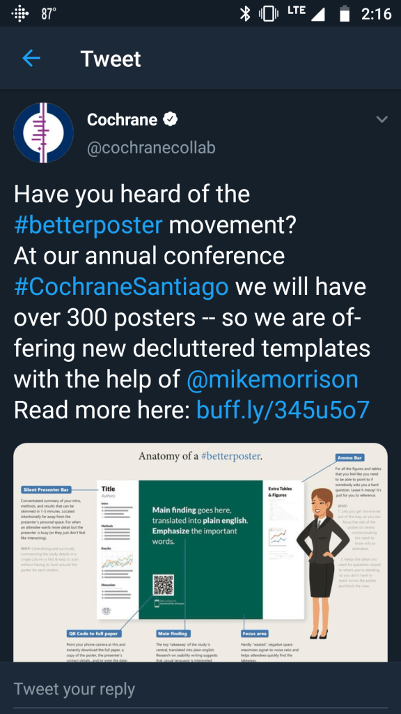
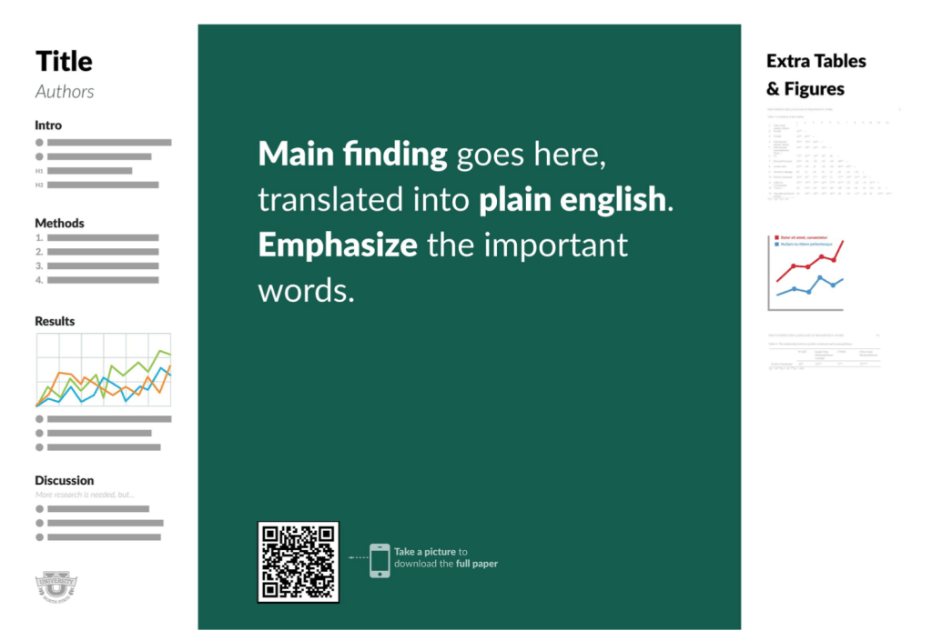
The design was created by Mike Morrison and aims to make conference posters easier to read and better at sparking conversation. A traditional poster design attempts to include as much information as possible and despite best efforts, usually looks cluttered and takes a long time to read. Morrison’s new design places the primary emphasis on the main point or outcome of the project, with just a small amount of text on the sides to provide some additional context (in the event that the presenter isn’t there to provide it).
According to Morrison, this type of poster design will allow presenters to “maximize insight transmitted to attendees, keep it easy to make and include what people ‘need to know’, not necessarily what’s ‘nice’ for them to know” (Flaherty 2019).
I agree that poster design can quickly become too complex to effectively share information and that more people should consider how they can share what’s important about their project both clearly and effectively. At past MLA conferences, I’ve seen posters so full of content that it would take me a full 15-minutes to understand what I was looking at, and I’ve also seen really clever and simple poster designs. And this was all in the same poster hall! It makes me wonder if poster standards vary widely between fields, and if this type of experience with posters is common across academia.
The one major issue I have with this super simplified poster design is that it strongly relies on a QR code to the full paper, so people who actually do want more information have a way to access it outside of the poster. However, my understanding is that in many instances, there is no paper at the time of presentation; either that comes later or it doesn’t happen at all. So when the poster is the only available medium for sharing information about a project, I think including more information on the poster is a valid and necessary approach.
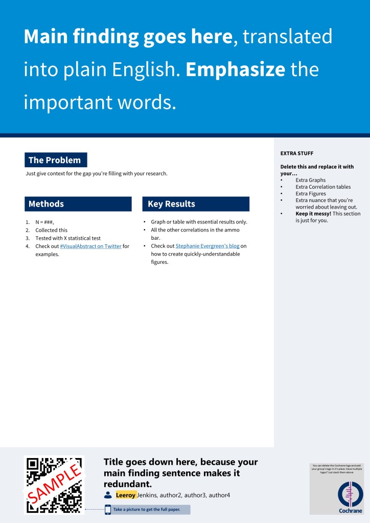
I was curious about the poster templates that were mentioned in the Cochrane tweet, so I checked those out, too. It may be a trick of the eye, but I think this format allows for more room for the details of the project than the original #betterposter.
If I do end up going the poster route for this upcoming MLA conference, I’ll be sure to keep these poster design ideas in mind. And I think we all could stand to spend some extra time considering how we can best share our ideas with our peers in a way that’s enjoyable and educational.
References
Flaherty, C. (2019). #betterposter. Inside Higher Ed. Accessed August 28, 2019. Retrieved from: https://www.insidehighered.com/news/2019/06/24/theres-movement-better-scientific-posters-are-they-really-better
Cochrane Collaboration. (2019). #BetterPoster templates for Cochrane Colloquium attendees. Accessed August 28, 2019. Retrieved from: https://www.cochrane.org/news/betterposter-templates-cochrane-colloquium-attendees
